Client's problem
"Our goal is to attract the best graduates to our internship. Every year the competition for the talented interns gets harder and harder. This is the main reason for getting an eye-catching website. Our programmes have lots of benefits and we need you to show them in a distinct and unique way. Young people enjoy digital industry and this should be our focus"
Solution
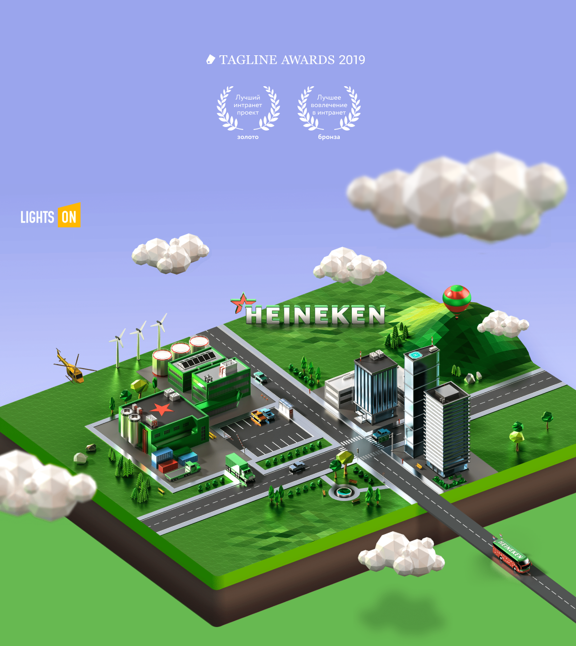
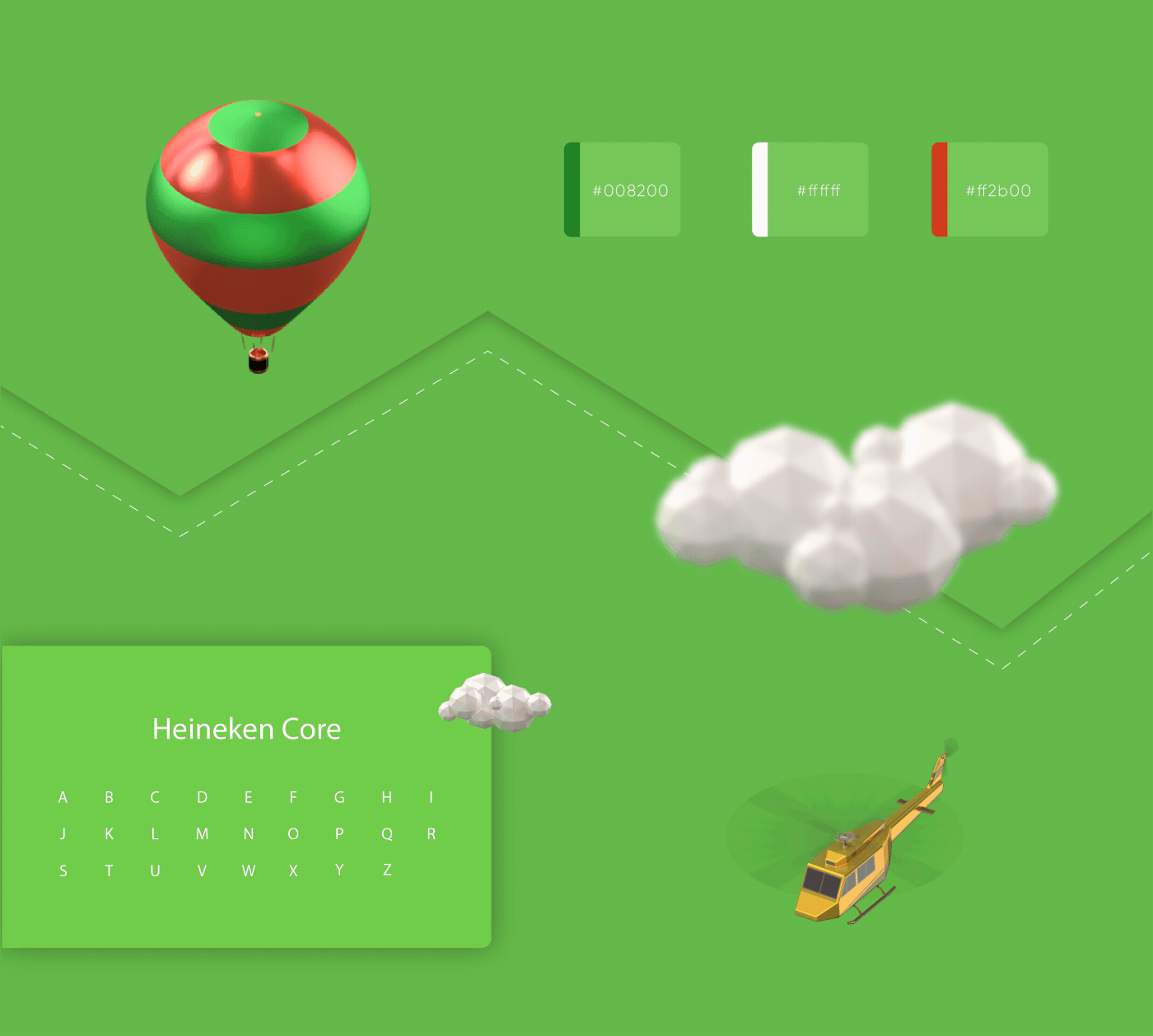
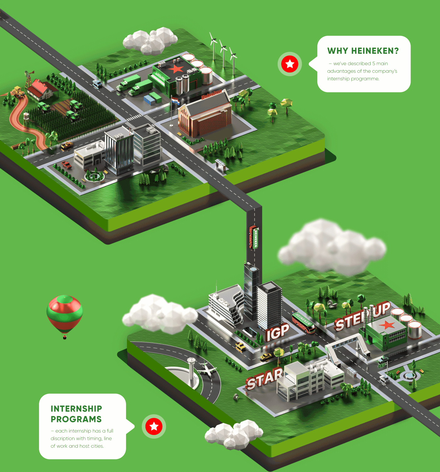
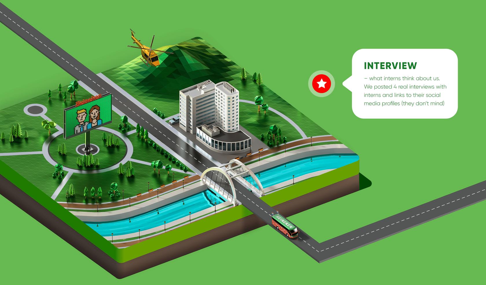
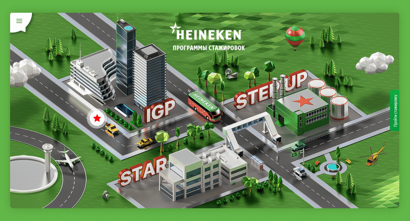
HEINEKEN’s corporate culture has inspired us to create a website journey through the map of possibilities. We’ve designed a bottle-green coloured world of breweries and offices, crossed by a party bus scroll that initiates interaction with the website. Mini-game style reflects the process of making one’s own choices. Users can click with the hints, browse HEINEKEN internship programmes and read the real interns reviews while "driving" through website.
Process
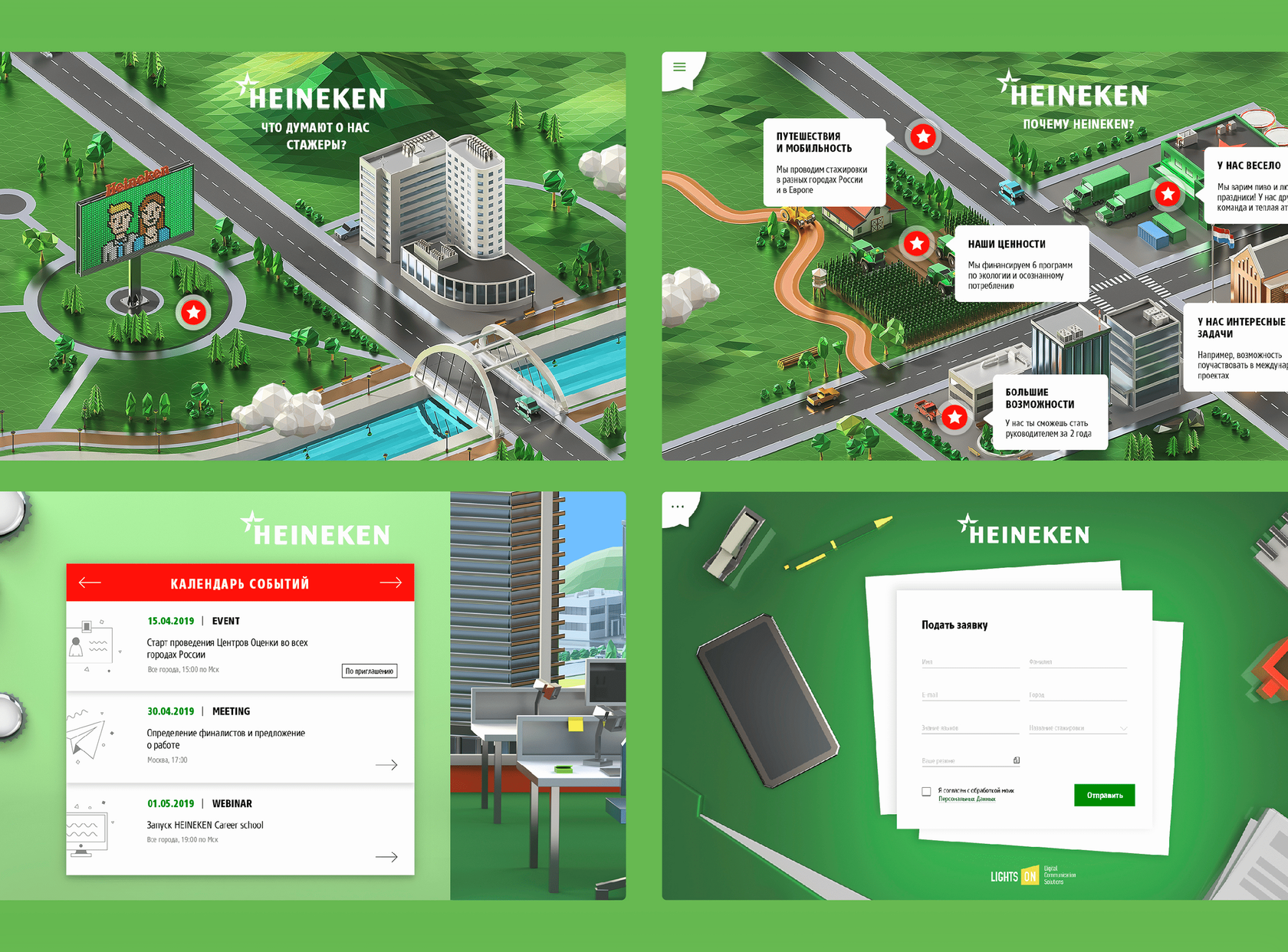
We’ve developed a structure where each screen shows the most important bits of information:
— 5 key benefits for the interns
— each programme’s description with timing, line of action and host cities
— 4 real interviews with alumni and links to their social media accounts (they don’t mind)
— application form
— 5 key benefits for the interns
— each programme’s description with timing, line of action and host cities
— 4 real interviews with alumni and links to their social media accounts (they don’t mind)
— application form

Animation
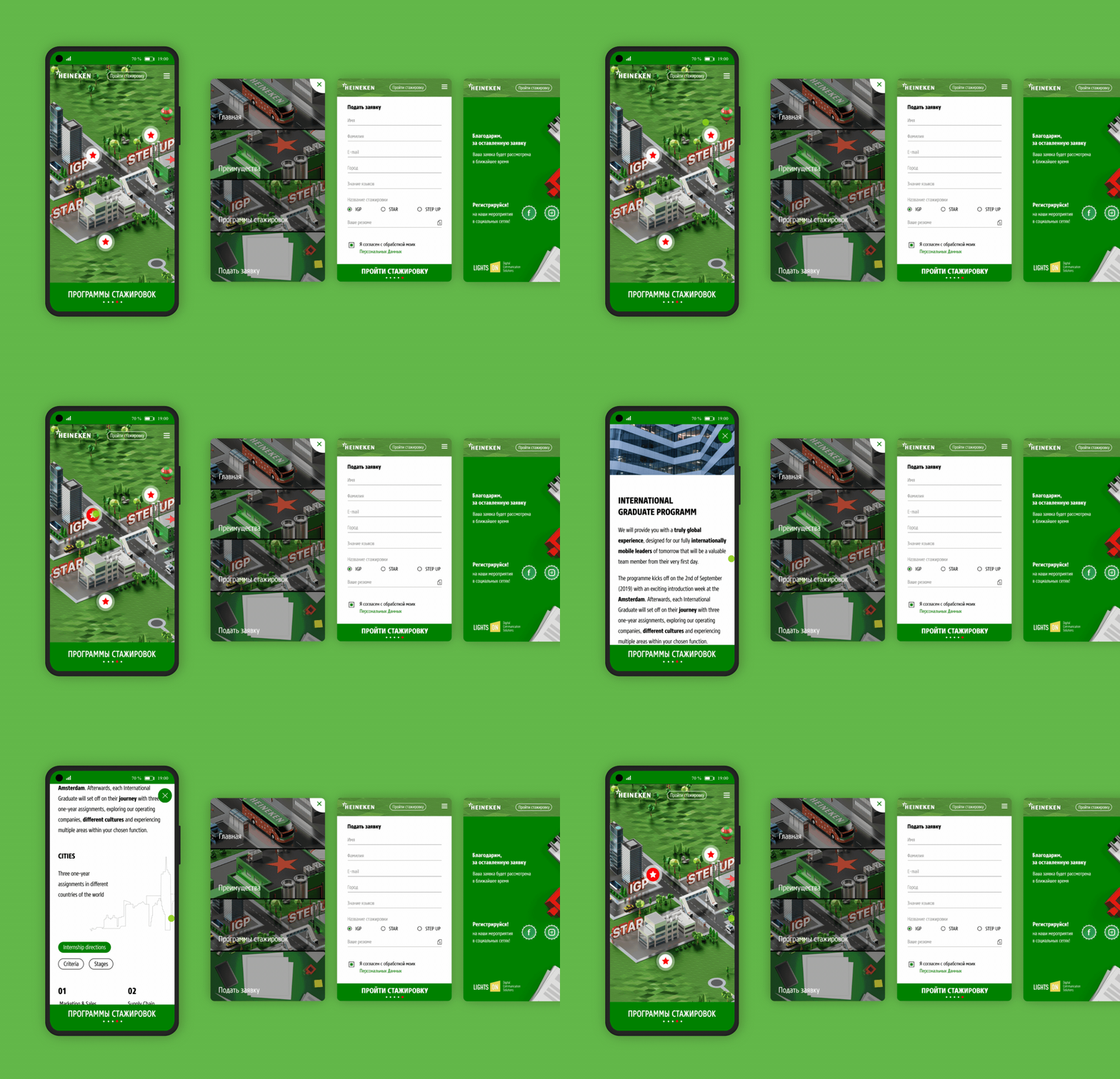
A simplified version of the site has been developed for mobile users.
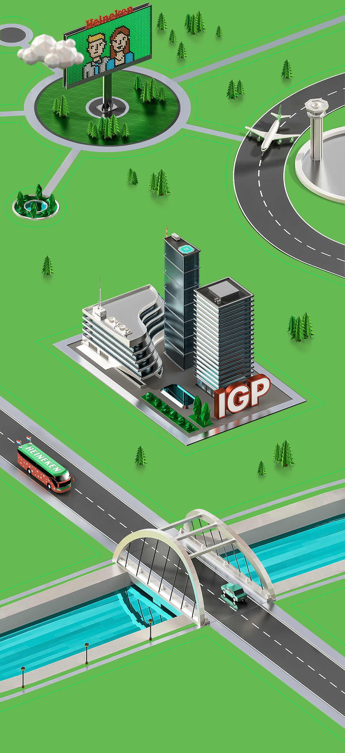
The animation includes diagonal scroll and small animated elements to make scenes more entertaining. The bus with interns drives through the site exploring it as users scroll the page.
The animation includes diagonal scroll and small animated elements to make scenes more entertaining. The bus with interns drives through the site exploring it as users scroll the page.


Other projects


